
iphonex适配
iphonex适配,我们所做的页面是webview中,头部适配不用考虑
但是对于底部,fixed定位的元素需要适配,iphonex底部有一个安全操作条,如果我们不适配的话,会导致操作在底部元素的上边,影响操作,所以底部元素的高度设置要比平时多43px,这是针对iphonex,其他的还是正常写,通过媒体查询或者js操作都可以解决这个适配问题。
公共样式:
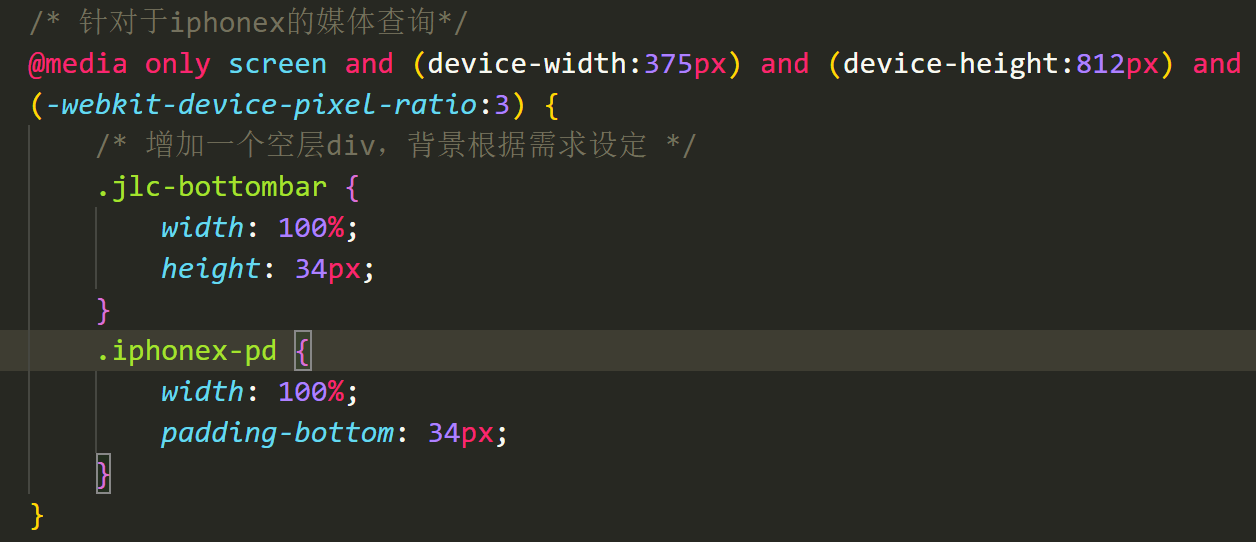
情况一:吸底
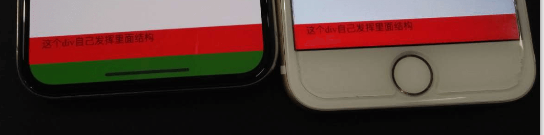
结构:

情况二:正常文档流
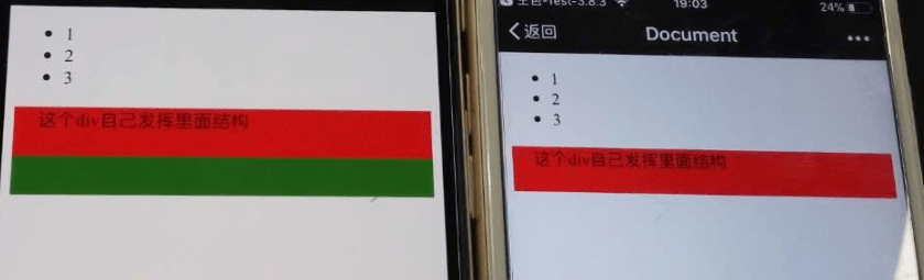
结构:

或者,直接在最下边加

情况三:如果吸底全是图片,最好有两张图,用于背景即可,如果用img的话可能还要使用js去替换图片,具体问题具体分析吧
情况四:页面内容本来就少,在分辨率大的iphonex上,就显得有点空白,具体问题具体分析
参考css
@media only screen and (device-width:375px) and (device-height:812px) and (-webkit-device-pixel-ratio:3) {
            body {
                padding-bottom: 34px!important;
            }
        }


@media only screen and (device-width:375px) and (device-height:812px) and (-webkit-device-pixel-ratio:3){
            /* 增加底部通透栏适配 */
            .jlc-bottombar{
                height: 100%;
                -webkit-box-sizing: border-box;
                box-sizing: border-box;
                padding-bottom: 34px;
            }
            .jlc-bottombar:after{
                content: '';
                z-index: 9998;
                position: fixed;
                left: 0;
                bottom: 0;
                width: 100%;
                height: 34px;
                background: #343434;
            }
            /* 对于fixed定位底部导航栏上移 */
            .bottombar-menu-fixed{
                bottom: 34px;
            }
            /* 纯色的背景可以控制 */
        }
1
2
3
4
5
6
7
8
9
10
11
12
13
14
15
16
17
18
19
20
21
22
23
24
25
26
27
28
29
30
31
2
3
4
5
6
7
8
9
10
11
12
13
14
15
16
17
18
19
20
21
22
23
24
25
26
27
28
29
30
31