
css选择器最后一个元素问题,自适应相等宽高的图片,Sticky footer
1.一个列表加载数据,有上拉加载更多,结构如下
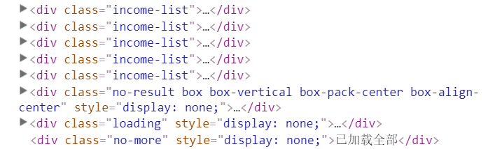
这时候我们使用选择器:last-child选中的元素是no-more,而不是我们想要的income-list,注意该选择器的意思,最后使用了:nth-last-child(4)选中的截图中的带有class为income-list的最后一个元素
2.自适应相等宽高的图片
在食物弹出页.设计图食物图的宽高是相等,每张图的宽高比例有可能有区别,但也要做自适应.解决就是用padding边距.
/* css样式: */
<style type="text/less">
    .imgs{
        width: 100%;
        height: 0;
        position: relative;
        padding-top: 100%;

        .image{
            position: absolute;
            top: 0;
            width: 100%;
            height: 100%;
            left: 0;
        }
    }
</style>
1
2
3
4
5
6
7
8
9
10
11
12
13
14
15
16
17
2
3
4
5
6
7
8
9
10
11
12
13
14
15
16
17
html结构:
<div class="imgs">
    <img src="..." class="image">
</div>
1
2
3
2
3
在父元素,边距的长是取决去宽的,所其宽度与边距的长是相等的. 在把高设为0,宽为100%,上边距100%,上边据就盒子的高.盒子是为正形. 子元素设宽与高为100%,那也是正形.
3.Sticky footer ----------->
当页面个信息少的时候,x就在下方,当页面内容多的时候,x就随之移动
/* css样式: */
<style type="text/less">
    .showDetil{
        position: absolute;
        width: 100%;
        height: 100%;

        .sellerDetil{
            width: 100%;
            min-height: 100%;
            padding-bottom: 40px;
        }

        .btn{
            position: relative;
            top: -40px;
            height: 40px;
        }
    }
</style>
1
2
3
4
5
6
7
8
9
10
11
12
13
14
15
16
17
18
19
20
2
3
4
5
6
7
8
9
10
11
12
13
14
15
16
17
18
19
20
html结构:
<div class="showDetil">
    <section class="sellerDetil"></section>
    <section class="btn"></section>
</div>
1
2
3
4
2
3
4